Mastering UI/UX with Glassmorphism

Table Of Content
Glassmorphism has rapidly become one of the most popular design trends in modern UI/UX. With its frosted-glass aesthetic, subtle transparency, and soft blurred backgrounds, it creates interfaces that feel elegant, layered, and futuristic. But implementing it effectively requires more than just adding a blur filter.
What is Glassmorphism?
Glassmorphism is a design style characterized by transparency, background blur, and subtle borders that create a frosted glass effect. Popularized by Apple's macOS Big Sur and Microsoft's Fluent Design System, this trend adds depth and hierarchy to flat design without the heaviness of traditional skeuomorphism.
The key properties that define glassmorphism are: a semi-transparent background, a backdrop blur effect, a subtle border (usually white or light-colored), and a slight shadow to create elevation.
When to Use Glassmorphism
Glassmorphism works best when layered over colorful or gradient backgrounds. It excels in cards, modals, navigation bars, and overlay elements where you want to maintain visual context while drawing attention to the foreground content.
However, it's important to use it sparingly. Overusing transparency effects can make text difficult to read and create accessibility issues. Always ensure sufficient contrast ratios between text and background elements.
Implementation Best Practices
Start with a solid color palette for your backgrounds — gradients with two or three harmonious colors work particularly well. Then layer your glass elements on top with a backdrop-filter blur of 10-20px and a background opacity between 10-30%.
Border styling is crucial. A thin border with low opacity (border: 1px solid rgba(255, 255, 255, 0.18)) creates the characteristic glass edge that separates the element from its background without being too harsh.
Accessibility Considerations
While glassmorphism is visually stunning, we must ensure our designs remain accessible. Always test text readability over various background colors. Consider adding a slightly higher opacity fallback for users with reduced transparency settings.
At Zee Brains, we combine aesthetic innovation with accessibility best practices. Every glassmorphic interface we build undergoes thorough contrast testing and screen reader validation to ensure beauty never comes at the cost of usability.
The Future of Glass-Inspired Design
As CSS capabilities continue to evolve with properties like backdrop-filter gaining wider browser support, we can expect glassmorphism to become even more sophisticated. Combined with animations and scroll-based interactions, glass elements can create truly immersive web experiences that captivate users.
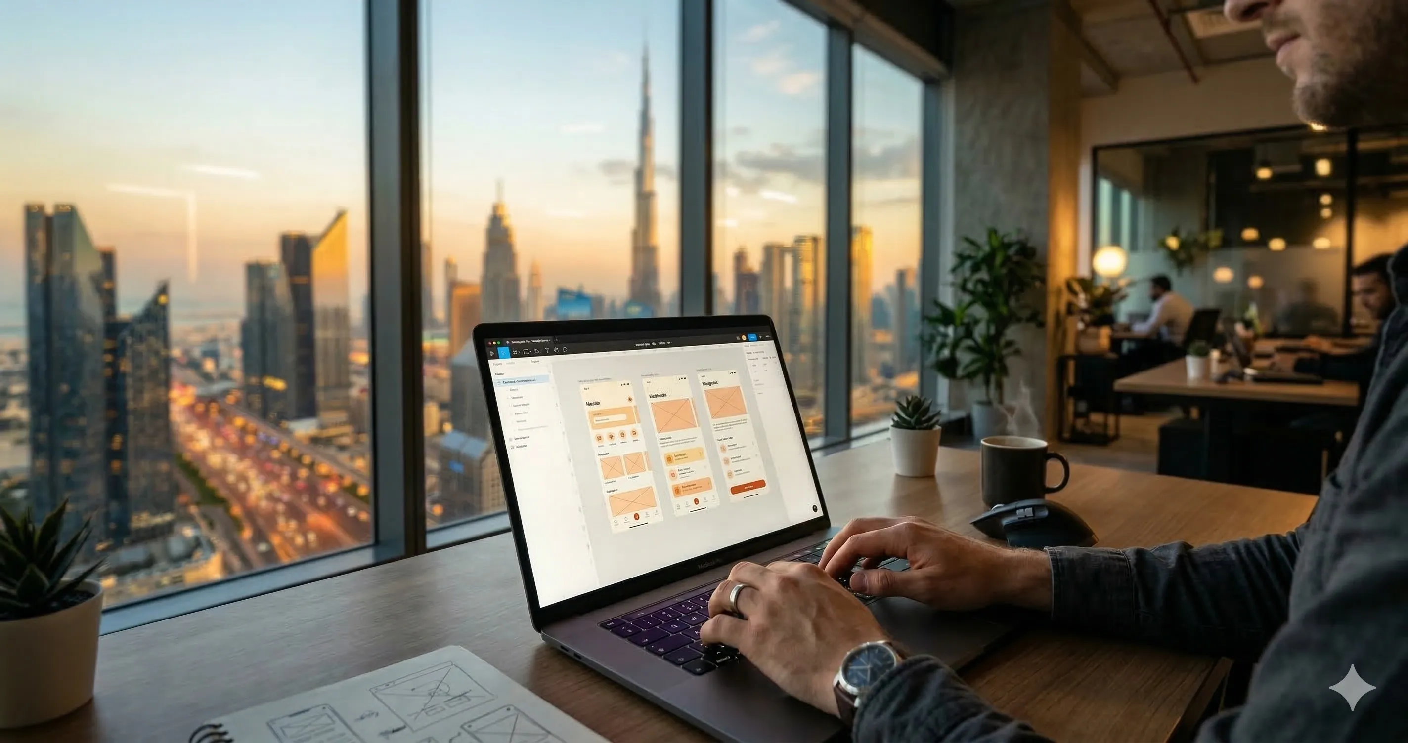
At ZeeBrains, glassmorphism is one of the UI techniques our design team applies selectively across web development projects in Dubai — particularly for SaaS dashboards, fintech interfaces, and luxury brand digital experiences.
The same design principles that make glassmorphism effective on web also apply to mobile. Our mobile app development team in Dubai implements glassmorphic UI patterns in Flutter and React Native using BackdropFilter and frosted glass components optimised for iOS and Android rendering.
For a deeper look at how modern design intersects with AI-generated interfaces, read our article on the future of AI in web development — exploring how tools like Figma AI and generative design systems are changing how teams like ours prototype glassmorphic interfaces.
The MDN Web Docs guide on backdrop-filter is the definitive CSS reference for implementing glassmorphism effects — covering browser compatibility, performance considerations, and fallback strategies.
For accessibility compliance, the W3C Web Content Accessibility Guidelines (WCAG 2.1) sets the contrast ratio standards (minimum 4.5:1 for normal text) that all ZeeBrains glassmorphic designs are tested against before launch.
Transform Your Digital Product's UI/UX with ZeeBrains
Want glassmorphism and cutting-edge UI/UX for your Dubai project? ZeeBrains delivers full-stack web development in Dubai with premium React.js UI/UX — glassmorphism, Neumorphism, and modern design systems that convert visitors into customers.
Building a mobile app with stunning design? Our mobile app development team in Dubai delivers pixel-perfect iOS and Android interfaces with modern UI aesthetics and intuitive UX flows.
For custom e-commerce with beautiful design and high conversion, see our e-commerce development services — we build stunning online stores for UAE and GCC brands.
Implementing Glassmorphism in React and Next.js Projects
Glassmorphism has become one of the most requested UI design trends for premium web applications, mobile apps, and SaaS dashboards built across Dubai and the wider UAE technology ecosystem. The frosted glass aesthetic, combining semi-transparency, blur effects, and subtle borders, creates an immediate perception of sophistication and depth that flat design alone cannot achieve. In this section, we explore the precise CSS implementation techniques and React component patterns that make glassmorphism both visually stunning and technically performant.
The core CSS for glassmorphism uses three fundamental properties: backdrop-filter for the blur effect, rgba() colors for transparency, and border properties for the glass edge definition. A typical glassmorphism card in CSS reads: background: rgba(255, 255, 255, 0.1); backdrop-filter: blur(10px); -webkit-backdrop-filter: blur(10px); border: 1px solid rgba(255, 255, 255, 0.2); border-radius: 16px;. The webkit prefix remains essential for Safari compatibility, which is particularly important for UAE audiences using Apple devices at high rates.
Performance Considerations for Blur Effects
Backdrop-filter blur is GPU-accelerated on modern browsers, but improper implementation can still cause performance issues on mobile devices and older hardware. The key optimization is to limit backdrop-filter usage to elements that actually require the glass effect — avoid applying it to high-frequency animation targets or elements that reflow frequently. Combine glassmorphism cards with will-change: transform to hint to the browser that these elements will be composited on their own GPU layer, dramatically improving scroll and animation performance.
For React applications, wrap glassmorphism components in React.memo() when they receive stable props, preventing unnecessary re-renders that can cause visual flickering of the blur effect. In Next.js projects, ensure glassmorphism components that use useState or animations are loaded as client components (using the 'use client' directive in Next.js 13+), since server components cannot handle browser-specific CSS properties like backdrop-filter during server-side rendering.
Color Theory and Gradient Pairing with Glassmorphism
The background behind glassmorphism elements is just as important as the glass element itself. Glassmorphism only works visually when placed over colorful, gradient, or image backgrounds that create the 'looking through glass' illusion. The most effective pairings combine vibrant purple-to-pink gradients (like Zee Brains' brand colors), blue-to-teal transitions popular in fintech apps, or abstract mesh gradients for creative agencies.
For dark-mode glassmorphism — increasingly popular in UAE enterprise applications — use rgba(0, 0, 0, 0.2) instead of rgba(255, 255, 255, 0.1) for the background, and reduce the border opacity to rgba(255, 255, 255, 0.05). This creates a sophisticated dark glass effect that feels premium and modern, perfectly suited for crypto platforms, trading dashboards, and enterprise SaaS applications that we frequently develop for UAE-based clients.
Accessibility and Readability in Glassmorphism Design
Beautiful design must never compromise accessibility. Glassmorphism's transparency creates inherent readability challenges — text over semi-transparent backgrounds often fails WCAG 2.1 contrast ratio requirements (minimum 4.5:1 for body text, 3:1 for large text). Solve this by adding a subtle text-shadow to foreground elements, increasing font weight to 500 or 600 for improved readability, or adding a slightly darker inner layer behind text-heavy sections within the glass card.
At Zee Brains, our design team creates glassmorphism interfaces that balance visual impact with functional excellence. Every UI component we build passes automated accessibility audits using axe-core, ensuring your product serves all users equally regardless of visual ability. Our portfolio includes multiple glassmorphism-forward products built for Dubai-based clients across fintech, e-commerce, and enterprise software categories — all achieving top Lighthouse UX scores above 95.
Glassmorphism Across Native Mobile Apps
Glassmorphism isn't limited to web applications. In iOS Swift development, the UIVisualEffectView with UIBlurEffect replicates the frosted glass look natively, with system-optimized performance that adapts to the device's graphics capabilities. For Android development using Jetpack Compose, the BlurMaskFilter or custom RenderEffect APIs create similar results. For cross-platform React Native projects, the Expo Blur package provides a unified API for blur effects across both iOS and Android, though note that Android blur effects have historically had more limitations than iOS implementations.
Contact our UI/UX team at Zee Brains to transform your digital product with cutting-edge glassmorphism design. We offer complete UI redesigns, component libraries, and design systems built specifically for your brand and technical requirements.
UI/UX Projects Featuring Glassmorphism Design
Explore how our design team applied glassmorphism and advanced UI/UX techniques in these live client projects:
Written by
Zee khan
Lead Designer
Passionate about building innovative digital solutions and sharing insights with the tech community.